
Core Tech
A seamless tool that dials the focus of team members and workflow while leaving room for fun.
Services Provided
Brand Strategy
Visual Identity
Brand Support
Brand Story:
The purpose of Core is to impact the way organizations collaborate as a team. They have seen how the workplace has changed its landscape in recent years which is why they care to incorporate new and dynamic ways to stay connected and communicate. Core, however, believes that fun is important to bring to hard-working focused teams. Through their application, they have given space for just that.
It is no surprise that through discussions, research, and strategy their brand values are collaboration, focus, and innovation. They wanted to cultivate a space that can make team members feel like a community. In order for goals and results produced to thrive. Giving them a compass for their brand attributes of being flexible, caring, and creative.
They also care about the impact they make on the earth and are conscious of ways that can be damaging. They have set up ways to make sure they are being responsible by making sure the code is clean and saves energy as well as using clean grids on which they store data and their network. Their building is no exception they have included solar panels as well.

Visual Identity:
Logo
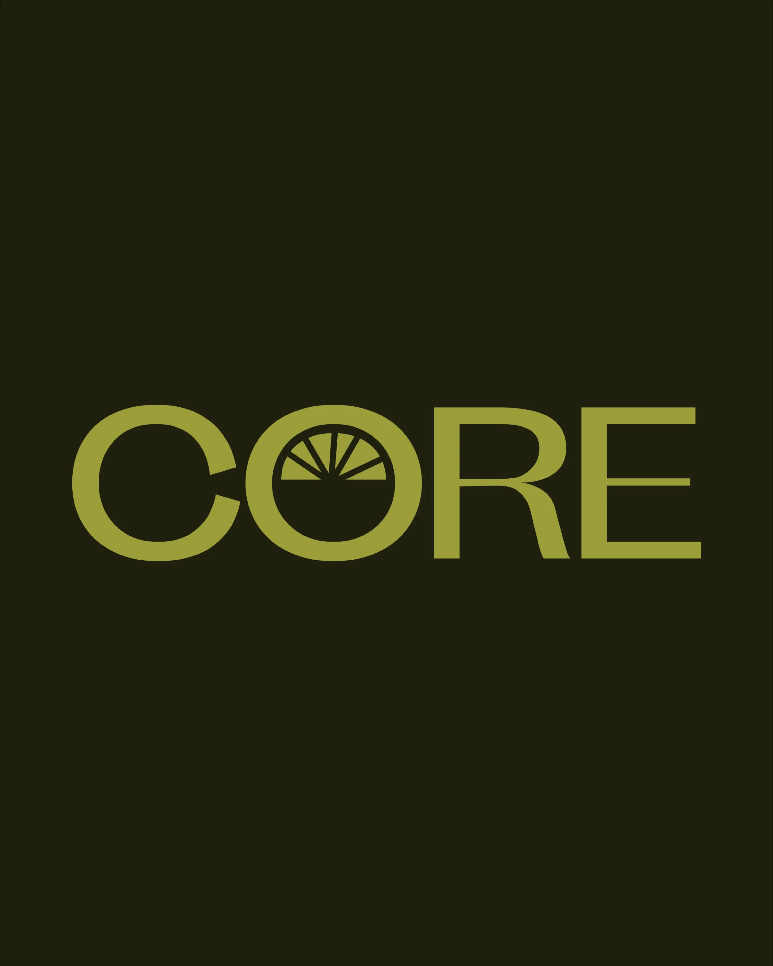
The center of any successful community and organization past, present, or future begins at the core of its community and people. Those that have built a foundation that stands firm. Being their mission to create a seamless tool that dials the focus of the team members and workflow while leaving room for fun, I explored various fonts that have an essence of that and built on it. The logotype started with Future Classic font however, it was customized by thickening the crossbars and cross strokes giving the logotype a grounding feel to emphasize focus. Also taking the star wheel that was inverted into the “o”.
The pairing of Future Classic with the Kohinoor Telugu family nicely balances the feel of creativity and focus.


The logomark starts with “o” from the primary logo and is connected to a semi-circle that is filled in and the inside inverted with a star wheel in the center. This is showcasing the connection between teams. Taking inspiration from old civilizations and tribes of people coming together in circles when gathering. The same is the visual story told in the mark with various people in an organization collaborating. With the star wheel in different colors, it is a visual representation of diversity. In the center of a larger encompassing half circle, you can see another circle which is similar to how Core supports organizations and their team members.
With a strong color palette, it grabs your attention and for them, that was important to show they are creating an innovative change in this space. Though bold and strong each color is specific to bring meaning to the brand and what they believe. The greens (Deep forest green and bright moss green) in this palette become the bracket grounding colors to the more vibrant and light colors. They represent the focus they wanted to show for themselves and to build for their users. The white allows for a more open feel that accepts collaboration. The coral orange has a hint of a pink tone to show both their flexible and caring side. Lastly, purple brought it together to give off the creativity for a space and platform like Core.


Brand Application:
Parts from the submark were a great use for pattern elements and shapes to be extracted and used in the brand experience and into the application of the brand's expression. Being incorporated in social graphics and other assets such as the star wheel that is seen on the website.
I put together ways the brand could be applied and brought to life through swag material, social graphics, and other touch points.


